Bay 12 Games Forum

Please login or register.

Login with username, password and session length
Advanced search  

Author Topic: Low hanging UI Fruit (Main Menu)  (Read 2549 times)

Slogo

  • Bay Watcher
    • View Profile
Low hanging UI Fruit (Main Menu)
« on: April 19, 2014, 09:49:45 am »

Ok I know I know the UI is not a priority, nor is the game "that hard to learn" or whatever. I actually agree with all of that. HOWEVER I still think part of DF's bad rap in people learning the game has a lot to do with really really simple UI stuff. Specifically I'm talking about the main menu. The problem with the main menu is not the wealth of options, or even having it expose the complexity of the game. I think a big part of the problem is just simple issues with layout and naming. Problems that should be very easy to remedy very quickly.

First what we are dealing with:
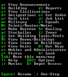

It's a mess! The most important menu options for new players (designations, stockpiles, zones) are spread all around the menu and most of the menu has no logical progression in how it reads. So new players see this and just give up on trying to parse it effectively. So anytime they forget a command they just get frustrated. I think we can do a lot better:


Here's a mock-up I've made. I've organized the menu in a top down fashion. At the top are all of your commands that interact with the world in some way (building, designations, stockpiles, etc.) that gives way into reports and listings which then gives into all of the view commands and finally the help/menu/movie commands.

NOTE: I forgot the Hot Keys menu option which should appear above TAB or to the right of View Units

I've also made a few changes:
Building should really be buildings (or build). It's the only singular noun in the whole list.
I did move the right column in a bit mostly because I could, though you wouldn't need to.
Some items have had their menu name shortened because they're unnecessary. Depot is the only menu option at all referring to Depot so having it say just Depot instead of Depot Access will confuse no one. Same with Move this menu/map which I changed to View Map.
I grouped line wide elements together as much as possible (as in lines that take the whole width). This way the UI reads cleaner and the columns are more distinct making the menu easier to parse visually.

I would probably also change Desginations text to something like Mining & Designations. ONe of the chief complaints about DF is "I couldn't even figure out how to mine". Having it easily identifiable will help to color player's first game perceptions.


Uh well that's it. I just wanted to show that there's some really really easy things that could be done that would probably help to improve the new player experience for Dwarf Fortress at a minimal amount of effort and no gameplay changes.

GavJ

  • Bay Watcher
    • View Profile
Re: Low hanging UI Fruit (Main Menu)
« Reply #1 on: April 20, 2014, 08:15:35 pm »

Your list still doesn't seem very close to actual frequency of use. Maybe it just depends on playstyle, but for me it's something like:

1) Q building thing
2) Designations
3) K look
4) V look at units
5) Building

then it gets murky (stockpiles? zones? z status? not sure). But having K and V underneath burrows? Come now. Especially for newer players.

Although perhaps this just highlights that there is no one solution. I do agree though that designations at least should be much less cryptically named.
Logged
Cauliflower Labs – Geologically realistic world generator devblog

Dwarf fortress in 50 words: You start with seven alcoholic, manic-depressive dwarves. You build a fortress in the wilderness where EVERYTHING tries to kill you, including your own dwarves. Usually, your chief imports are immigrants, beer, and optimism. Your chief exports are misery, limestone violins, forest fires, elf tallow soap, and carved kitten bone.

Slogo

  • Bay Watcher
    • View Profile
Re: Low hanging UI Fruit (Main Menu)
« Reply #2 on: April 22, 2014, 03:43:49 pm »

Your list still doesn't seem very close to actual frequency of use. Maybe it just depends on playstyle, but for me it's something like:

1) Q building thing
2) Designations
3) K look
4) V look at units
5) Building

then it gets murky (stockpiles? zones? z status? not sure). But having K and V underneath burrows? Come now. Especially for newer players.

Although perhaps this just highlights that there is no one solution. I do agree though that designations at least should be much less cryptically named.

Yeah I organized it by some rough category criteria (stuff that places/modifies the world, status reports, then viewing objects). Obviously that presents problems with burrows vs look and so on.

Frequency of use would be another good way of organizing it, so something like what you listed. That also has it's own pros and cons; the stuff up top is most likely what someone wants to do, but it also doesn't directly flow in a logical way.

As a suggestion I don't mean to prescribe one way as right, instead I just want to point out that there seems to be a bunch of different ways to do it that would be a step up from the current chaotic organization. It doesn't need to be the perfect way, it just needs to be slightly better for new players (experienced players will look at the menu less often). Heck even grouping/moving the full length options to be together would make the main menu way more readable than it currently is. Even as an experienced player I think it's far easier to memorize the hotkey for a menu than it is to find that menu option on the main menu which seems horribly backwards; the only reason to show the main menu is to help new players who haven't memorized anything yet.
« Last Edit: April 22, 2014, 03:47:18 pm by Slogo »
Logged

Dirst

  • Bay Watcher
  • [EASILY_DISTRA
    • View Profile
Re: Low hanging UI Fruit (Main Menu)
« Reply #3 on: April 23, 2014, 09:23:46 am »

As a suggestion I don't mean to prescribe one way as right, instead I just want to point out that there seems to be a bunch of different ways to do it that would be a step up from the current chaotic organization.
Or just go whole-hog and have the menu configurable in an init file, maybe even switchable via hotkey (for example, a "building mode" arrangement and a "fighting mode" arrangement).
Logged
Just got back, updating:
(0.42 & 0.43) The Earth Strikes Back! v2.15 - Pay attention...  It's a mine!  It's-a not yours!
(0.42 & 0.43) Appearance Tweaks v1.03 - Tease those hippies about their pointy ears.
(0.42 & 0.43) Accessibility Utility v1.04 - Console tools to navigate the map

GavJ

  • Bay Watcher
    • View Profile
Re: Low hanging UI Fruit (Main Menu)
« Reply #4 on: April 23, 2014, 01:51:05 pm »

Quote
Or just go whole-hog and have the menu configurable in an init file, maybe even switchable via hotkey (for example, a "building mode" arrangement and a "fighting mode" arrangement).
If you know how to do this, and actually have enough of an opinion on how you want to organize it, then you probably already have all the hotkeys memorized and it doesn't matter anymore anyway.

The hotkey menu is in a unique position of being something where modding isn't very important or helpful, as it is primarily a reminder to newer players who don't mod yet.


So there isn't one best way, but there DOES have to be one actual way, sort of. Unless perhaps you ask the new player in plain English "Would you like your menu interface to be indexed by theme or by frequency of likely use, or by order you will need things from the start of your first fort?" etc.
Logged
Cauliflower Labs – Geologically realistic world generator devblog

Dwarf fortress in 50 words: You start with seven alcoholic, manic-depressive dwarves. You build a fortress in the wilderness where EVERYTHING tries to kill you, including your own dwarves. Usually, your chief imports are immigrants, beer, and optimism. Your chief exports are misery, limestone violins, forest fires, elf tallow soap, and carved kitten bone.

Dirst

  • Bay Watcher
  • [EASILY_DISTRA
    • View Profile
Re: Low hanging UI Fruit (Main Menu)
« Reply #5 on: April 23, 2014, 02:41:20 pm »

Quote
Or just go whole-hog and have the menu configurable in an init file, maybe even switchable via hotkey (for example, a "building mode" arrangement and a "fighting mode" arrangement).
If you know how to do this, and actually have enough of an opinion on how you want to organize it, then you probably already have all the hotkeys memorized and it doesn't matter anymore anyway.

The hotkey menu is in a unique position of being something where modding isn't very important or helpful, as it is primarily a reminder to newer players who don't mod yet.


So there isn't one best way, but there DOES have to be one actual way, sort of. Unless perhaps you ask the new player in plain English "Would you like your menu interface to be indexed by theme or by frequency of likely use, or by order you will need things from the start of your first fort?" etc.
I was envisioning an ESC-menu Settings item to change the layout, with options that could be assigned to hotkeys should the player choose.  The newbies themselves won't do much of the modding, but the community might settle on a favorite layout that finds it way back into vanilla.  Or things could devolve into a QWERTY-vs-DVORAK battle.

I can definitely see a layout specifically tailored to quickstarts and another with 3- or 4-letter abbreviations for semi-experts to cram as many options on the screen as possible.  Cramming wouldn't help much for the main menu, but it might come in handy for multi-page things like the Build menu.
Logged
Just got back, updating:
(0.42 & 0.43) The Earth Strikes Back! v2.15 - Pay attention...  It's a mine!  It's-a not yours!
(0.42 & 0.43) Appearance Tweaks v1.03 - Tease those hippies about their pointy ears.
(0.42 & 0.43) Accessibility Utility v1.04 - Console tools to navigate the map

Slogo

  • Bay Watcher
    • View Profile
Re: Low hanging UI Fruit (Main Menu)
« Reply #6 on: April 24, 2014, 02:07:24 pm »

That would help for people who use things like the Lazy Newb pack which could include configuration, but would also be relying on that.

More importantly though, while not a bad suggestion at all, it's some appreciable amount of work rather than something very bare bones. Even if what you suggested was slated to be added, in the mean time a simple re-ordering would help to at least make the main menu more presentable and digestible and could be accomplished in probably as much time as people here have spent talking about it.

WJLIII3

  • Bay Watcher
    • View Profile
Re: Low hanging UI Fruit (Main Menu)
« Reply #7 on: April 25, 2014, 12:17:59 pm »

Your list still doesn't seem very close to actual frequency of use. Maybe it just depends on playstyle, but for me it's something like:

1) Q building thing
2) Designations
3) K look
4) V look at units
5) Building

then it gets murky (stockpiles? zones? z status? not sure). But having K and V underneath burrows? Come now. Especially for newer players.

Although perhaps this just highlights that there is no one solution. I do agree though that designations at least should be much less cryptically named.

Frequency of use is unimportant on a keyboard menu. The things you'll need to do first are first. The things you do most often aren't on the menu, they're under your left hand, on "q"
Logged

GavJ

  • Bay Watcher
    • View Profile
Re: Low hanging UI Fruit (Main Menu)
« Reply #8 on: April 25, 2014, 01:07:08 pm »

The concept behind the frequency comment was that newbies who don't remember the shortcuts will begin scanning the menu to remember what they are, likely starting near the top. Thus, highest frequency menu items on top means least searching time on average.

Which ones you use first for a new fort is also a valid strategy. I can see it go either way, probably would simply require empirical testing and "focus group" feedback to know for sure.
Logged
Cauliflower Labs – Geologically realistic world generator devblog

Dwarf fortress in 50 words: You start with seven alcoholic, manic-depressive dwarves. You build a fortress in the wilderness where EVERYTHING tries to kill you, including your own dwarves. Usually, your chief imports are immigrants, beer, and optimism. Your chief exports are misery, limestone violins, forest fires, elf tallow soap, and carved kitten bone.

gritstone

  • Bay Watcher
    • View Profile
Re: Low hanging UI Fruit (Main Menu)
« Reply #9 on: April 28, 2014, 02:17:41 pm »

It's not a bad idea, you're more likely to need to find the key to do what you want rather than know the key and want to find out what it does.  So ordering the items in some sensible way is more important than ordering the keys.

Why not split the options into smaller logical groups and separate the groups with a little vertical space?  It might make things easier to read and find rather than one monolithic list.  It's only relatively recently that I noticed items are grouped to some extent, but horizontally, like Unit List and Job List.  People are much more used to vertical groupings in software menus, so I didn't catch on to why they are where they are.
Logged

Slogo

  • Bay Watcher
    • View Profile
Re: Low hanging UI Fruit (Main Menu)
« Reply #10 on: May 01, 2014, 03:33:13 pm »

Yeah not bad suggestions. The problem I have with the current horizontal design is that the options spanning 2 columns and the options spanning 1 column are so intermixed that it visually reduces the clarity of the 2nd column. So you end up not reading the 2 distinct columns nearly as well as you could. This, in effect, feels like it's not only hiding the right options in plain sight, but also making it harder to quickly read the left column.

JonathanCR

  • Bay Watcher
    • View Profile
Re: Low hanging UI Fruit (Main Menu)
« Reply #11 on: May 08, 2014, 11:09:03 am »

Great idea. It's just a request to display some static text in a different order, basically, requiring no reprogramming of the UI or anything arcane and not-going-to-happen like that, but it would make a very big difference. This is something Toady could spend ten minutes doing and then forget, but I think it would make the screen more accessible. I agree that the arrangement of the menu as it stands is a mess and difficult to read.
Logged

Putnam

  • Bay Watcher
  • DAT WIZARD
    • View Profile
Re: Low hanging UI Fruit (Main Menu)
« Reply #12 on: May 08, 2014, 01:18:19 pm »

This is something Toady could spend ten minutes doing and then forget

Finally, a context where I can agree with this statement instead of having two pages to debate about it.

PeridexisErrant

  • Bay Watcher
  • Dai stihó, Hrasht.
    • View Profile
Re: Low hanging UI Fruit (Main Menu)
« Reply #13 on: June 04, 2014, 09:29:51 pm »

I also support this, it's a simple and effective way to make life easier - and while great for new players, it won't even mess with the reflexes of veterans. 
Logged
I maintain the DF Starter Pack - over a million downloads and still counting!
 Donations here.

Cobbler89

  • Bay Watcher
  • Cobbler cancels celebrate Caesar: mending soles
    • View Profile
Re: Low hanging UI Fruit (Main Menu)
« Reply #14 on: June 04, 2014, 09:52:06 pm »

I think "Depot Access" should stay "Depot Access" and not be shortened to just "Depot". Why? Because the other big problem with most of the menu options is that if you don't already know how the game works, the big list of words borders on meaningless. The real UI problem DF has is that the UI doesn't teach you how the game works, so you can't just learn how to play the game by looking at the menu. That's, obviously, a big challenge to improve upon. But the point here is Depot Access is perhaps the one exception (although granted flashing the whole screen red when no depot exists is less helpful than it could be) -- it doesn't leave you wondering, "What about the depot is this?" it says -- access. The fact that there isn't any other menu item relating to the depot is irrelevant, because it's not just other menu items that it has to be distinguished from; it has to be distinguished from anything else you could do with the depot, so you know the menu option "Depot" isn't for assigning trade goods to it or for building it or whatever. Granted you can figure all that out through trial and error and reading the wiki -- but right now, unlike virtually everything else in the game, you don't have to because the name has "Access" in it actually more or less telling you what it's for. Instead of trimming that down, we need more of the menu to "unnecessarily" spell out more of what they do rather than just the name of the subject matter -- although that's probably a separate matter from this proposed rearrangement, and subject to the default 25/80 size being horribly cramped and all, so probably more ideas need to be batted around elsewhere as to how in-game use of the menu could be more self-explanatory.

That came off more ranty than I intended, so no offense meant; but I just hope I explained my points clearly enough. ;^)
Logged
Quote from: Mr S
You've struck embedded links. Praise the data miners!
Quote from: Strong Bad
The magma is seeping under the door.

Quote from: offspring
Quote from: Cobbler89
I have an idea. Let's play a game where you win by being as quiet as possible.
I get it, it's one of those games where losing is fun!
I spend most of your dimension's time outside of your dimension. I can't guarantee followup or followthrough on any comments, ideas, or plans.